Author: admin

  • Another iPhone app UI by Jeremiah Shaw

    The Shot

    The Original Layout

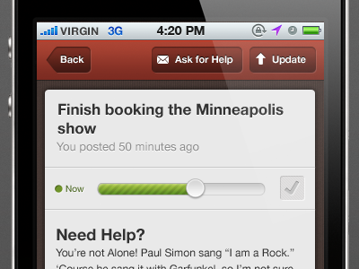
    I had to make some assumptions as to the purpose of this screen.  I’m assuming the user clicked on one of their tasks and this is the task update screen.   The previous Shot on Dribbble shows tips and encouragements, so I’m assuming that’s what “ask for help” is all about.  

    The slider is gorgeous, but is it adjusting the timeframe (“now” versus “later”) or the completion percentage of the task?   Is the checkbox for marking the task as complete?
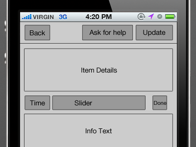
    I’ll do the layout

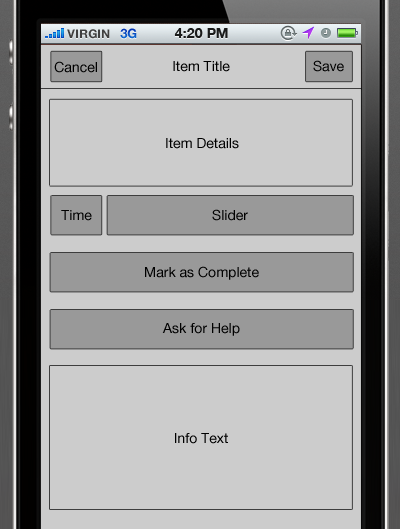
    The header was a bit cluttered with an assortment of actions.  If this is truly a task update screen, let’s make it a normal Cancel/Save header.  Of course, keep the custom button treatment.

    We can keep the now/later indicator and the slider together.    The slider is so beautiful, make it bigger!    If that checkbox really is a “complete” control, let’s pull that out.   The user should be excited to complete a task, so make it a big beautiful button that has a clear call-to-action.   Additionally, have a help call-to-action.

    The text at the bottom of the Shot was just helper text, right?   If so, we can still tuck that at the bottom of the screen.

  • iPhone app UI by Jeremiah Shaw

    The Shot

    The Original Layout

    Tabs on the top isn’t iOS friendly.    

    I’ll do the layout

    You can definitely keep the custom UI for the tabs, just put them on the bottom. If you want to keep the notch that connects the tab to the filter bar, the filter bar can be docked to the bottom as well.

    The Now/Later Tips/Encouragement tag filters are colored differently.  Based on the content in the mockup, the color has no relevance on whether the filter is active.  If you are trying to differentiate the types of filters, labels would be more efficient.

  • Digiti Back office

    The Shot

    The Original Layout

    The only issue is the button placement.  The hierarchy is top-level nav (time/projects/profile), secondary projects nav (the list of projects) and then finally timelines for the project.    We need to associate those buttons with the proper areas.   The search button is in the projects header but we are already showing a search box.   If you meant the search button to reveal the search box, the button should be visually connected to the box.   If not, we should move the button down next to the search box.

    The second button problem is the Today button.  Why is it floating in the tab subheader?   If it is used to jump to the project timeline for today, it should be in the date header.    

    I’ll do the layout

    By moving the Today button out of the subheader, you can shrink it down.  You can still use a thin, colorful subheader to help the user know what area of the site they are using.   

  • Design is Choice

    It’s impossible to create a simple product or a simple interface if every need and feature request is met—doing that that leads to clutter and bloat. Good design is about choice, and choice isn’t just about saying ‘yes’ to that one thing, it’s about saying ‘no’ to everything else, too.

    Dmitry Fadeyev

  • Fifteen Games

    Stolen from Kendra.

    The rules: Don’t take too long to think about it. 15 games you’ve played that will always stick with you. List the first 15 you can recall in no more than fifteen minutes.

    1. D&D
    2. Shadowrun
    3. Battletech
    4. Final Fantasy I/III
    5. Magic: the Gathering
    6. Street Fighter II
    7. Bust-a-Move
    8. Diablo II
    9. Ascendancy
    10. King’s Quest V/VI
    11. Unreal Tournament
    12. Halo 3 Alpha
    13. Grand Theft Auto III
    14. Gran Turismo 2/3
    15. Maniac Mansion
  • Worldwake Draft Pointing Chart

    Well, whenever I draft online, I often refer to the set reviews on Channel Fireball.  Some of the more recent set reviews do not list out the name of the card on the page so it’s quite tough to quickly find a value.   I decided to use some new-found InDesign skills and whip up a little layout.   Others might find this useful:

    WWK_draft

  • Songs that give me the chills

    …in a good way, of course.

    • Sealegs – The Shins
    • Super-Connected – Belly
    • Give You Nothing – Bad Religion
    • Goreki – Lamb
    • This Night Has Opened My Eyes – The Smiths (and the At The Drive In cover)
    • Sober – Tool
    • Dont Fear (The Reaper) – Blue Oyster Cult
    • D-7 – Wipers
  • Did anyone want an oversized iPod touch?

    Apple positions the new iPad as the middle ground between phones and laptops.   They state that netbooks were supposed to fill that void, but their typical slow speed kills that solution.  How does Apple decide to bridge the gap?   Take the OS from their phone and slap it on a 10 inch screen and price it aggressively.  Once the initial hype wears off, I don’t see Apple selling even 15% as many iPads as iPhones.

    How can you not love this thing?  It’s like a huge iPhone with awesome new apps!

    Unfortunately, there is a lot missing in comparison to an iPhone.  It’s lost, primarily, the ability to make phone calls!  Also, no camera, no GPS, no compass and the screen DPI drops by 20%.  If you’re carrying around your iPad, you better make sure you have your iPhone as well.

    Who cares!  That screen is huge!  It can do all sorts of things!

    No, it still doesn’t support multitasking or any sort of notification system.  Yes, there are apps that will support the iPad natively, but how efficient will you be using the iPad apps when you could just carry your laptop instead?   Yes, I think the iPad going to be used in addition to a laptop, not instead.  There are just too many things you cannot do with just an iPad.

    It’s only $499!

    Sort of.  If you want just 16GB of storage, no 3G and no accessories, that fine.  Anyone that wants to make serious use of the device would easily pony up for the 3G model and the keyboard dock, at a minimum.   The 64GB 3G model and a keyboard dock will be just under that magical $999 price point.  Again, why wouldn’t you buy a laptop?

  • The Good, the Bad and the OCD at I ♥ wireframes

    My career/passion is mobile wireframing.  What’s wireframing?  Wireframing is the process of creating a wireframe.   Alright, what’s a wireframe, a-hole?  A wireframe is a mockup of the structure and behavior of a product that does not imply final colors or visuals.  Imagine all of your favorite websites reduced down to shades of gray and without any images.   Sounds pretty boring, eh?  Seeing these sites reduced to their core state actually explains a LOT about usability and functionality.  Pretty much any site that has more than 1K users probably start with a wireframe.

    I found a new site that shows informative examples of wireframes accurately named “I ♥ wireframes”.  Looking through the latest 25 or so posts, I’m seeing a few trends.  First, some people spend _WAY_ too much time on a drawn wireframe.  If you need to make changes, there is no point in using high fidelity on an uneditable medium.  Lastly, there are always better ideas out there.  I’ve discovered a few annotation ideas I’ll definitely be using for my next major project.

    On to the point of this post, displaying what I consider to be good and bad/nutso wireframes.  If it’s listed on “I ♥ wireframes”, there aren’t going to be any poorly-created ones so I’ll just point out the OCD ones.

    Good

    Bad/OCD